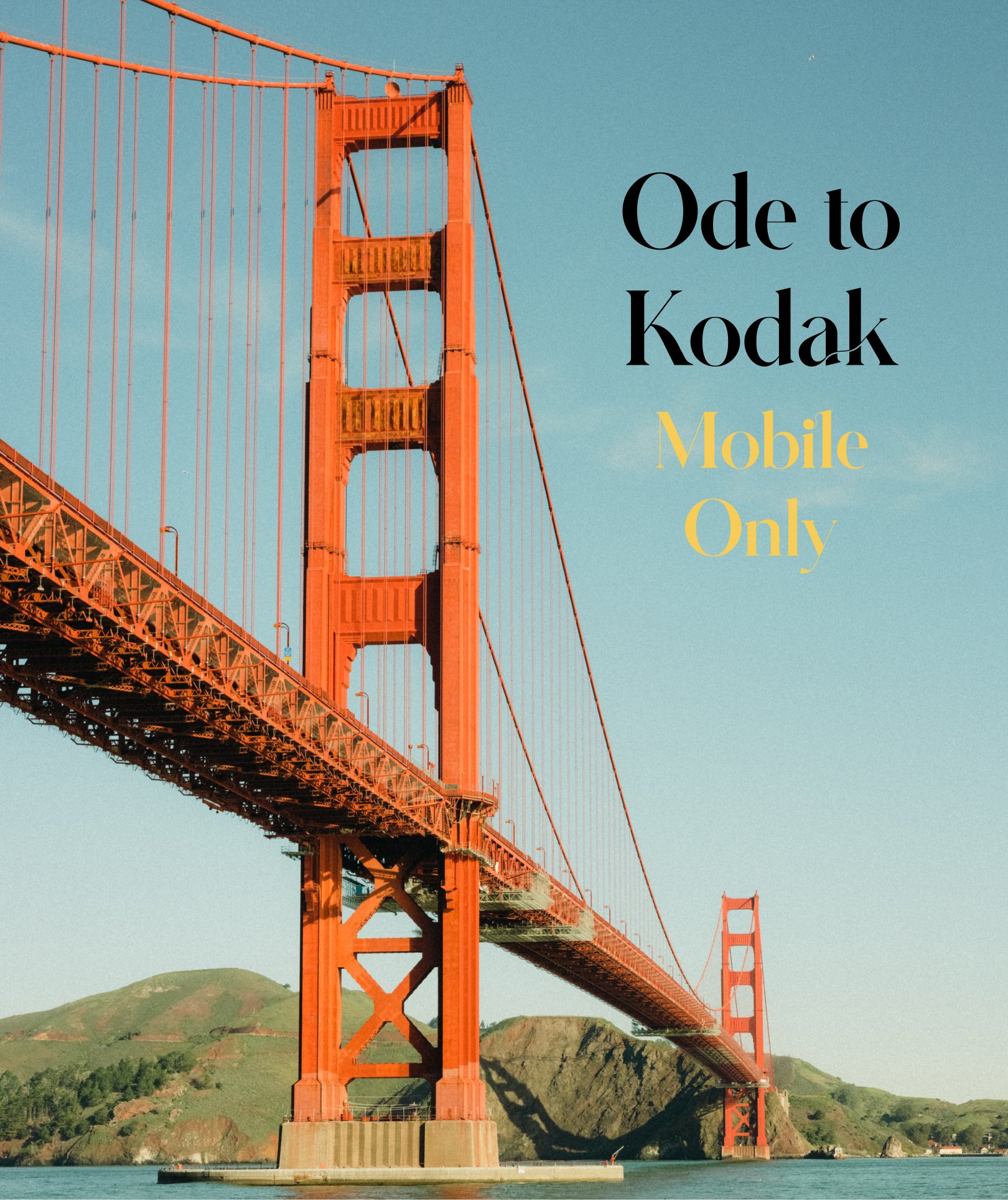
Image 1 of 8
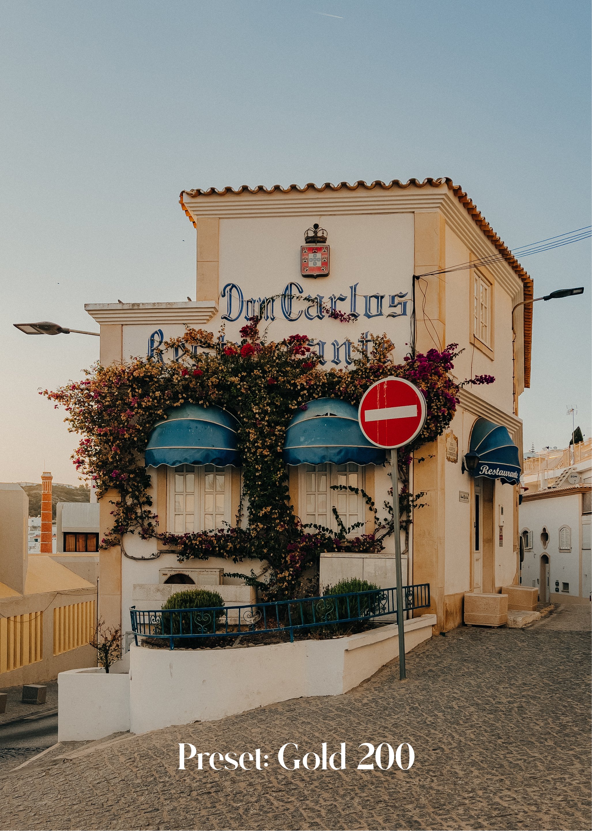
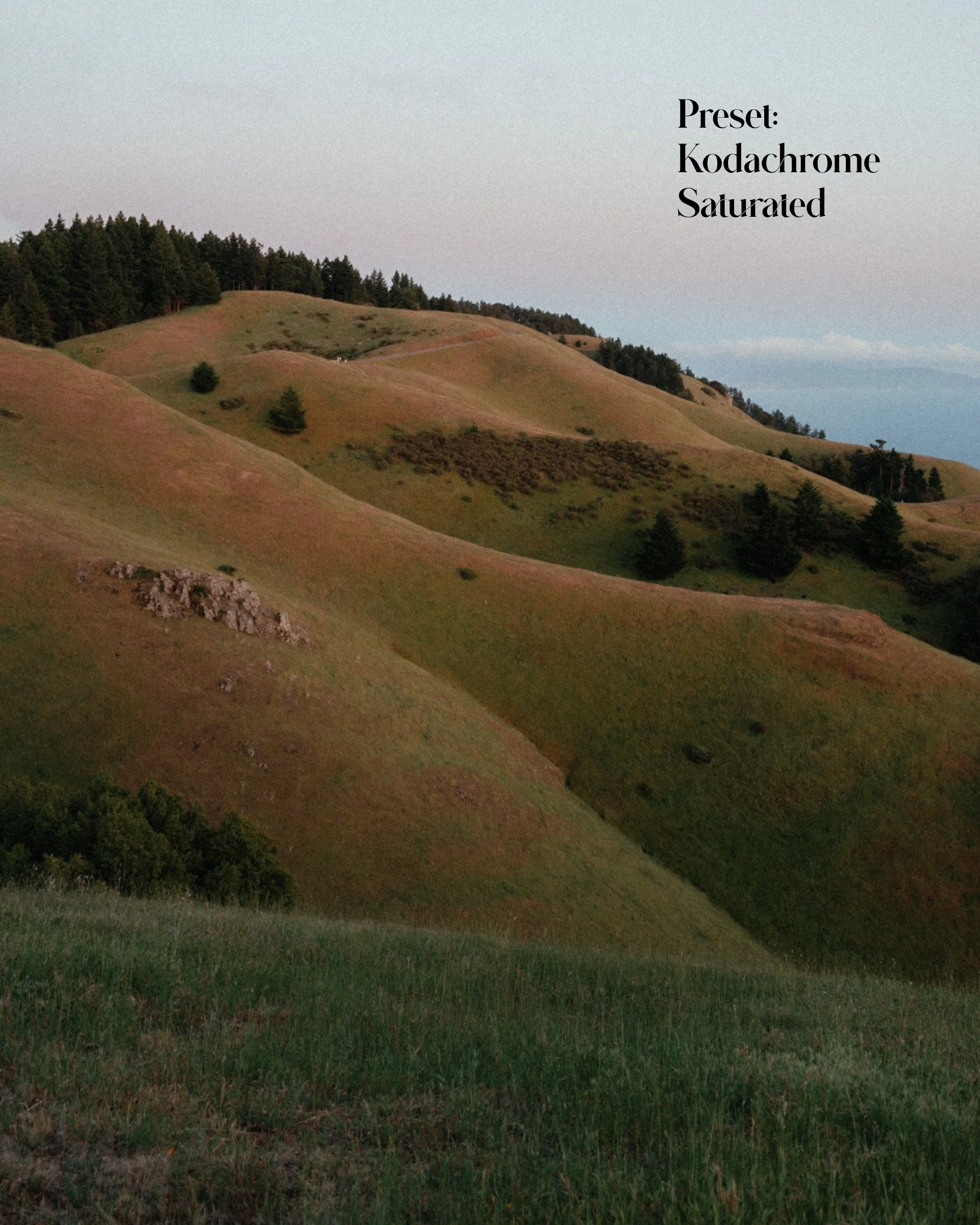 Image 2 of 8
 Image 3 of 8
 Image 4 of 8
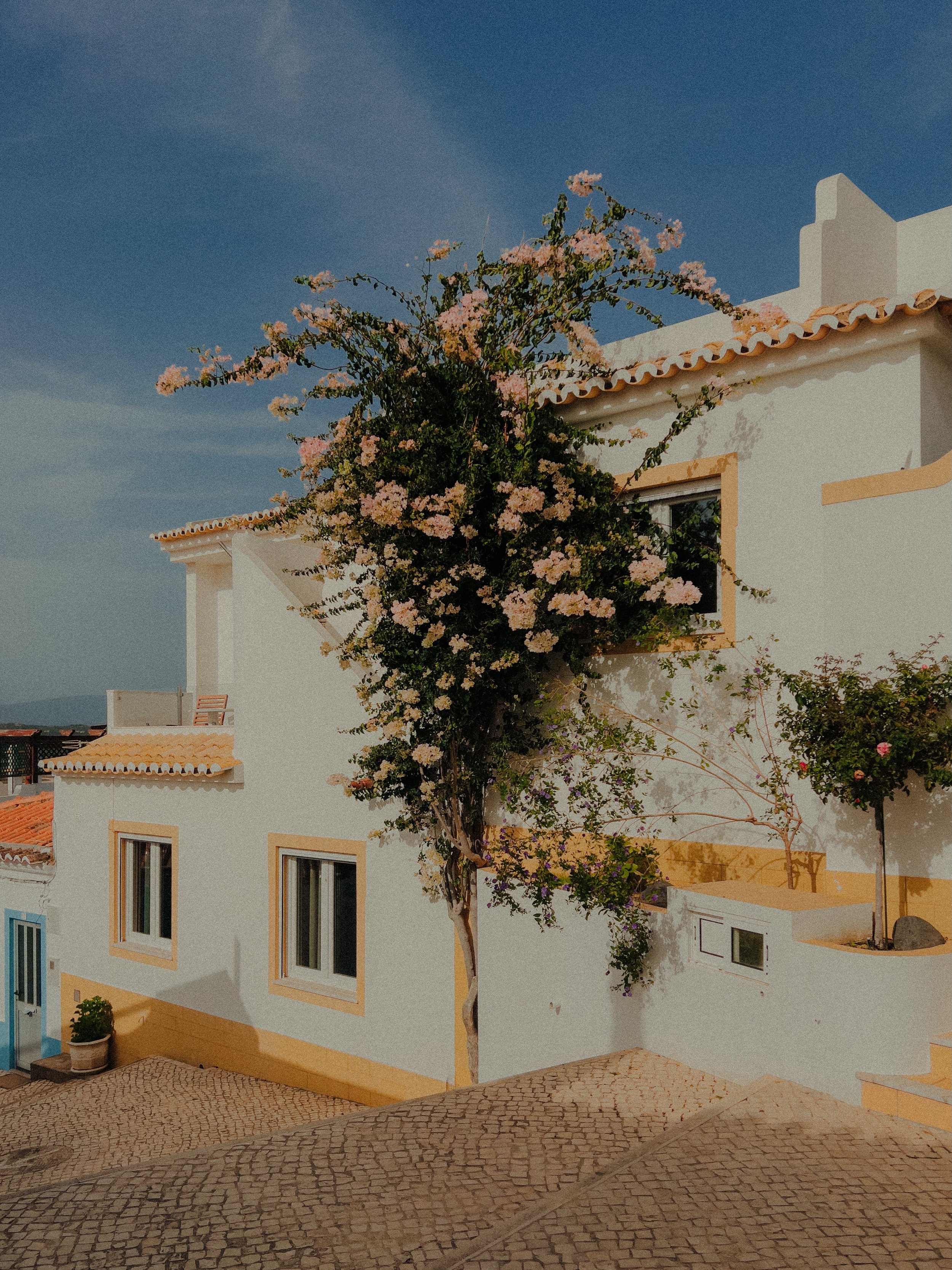
 Image 5 of 8
 Image 6 of 8
 Image 7 of 8
 Image 8 of 8
About
After 5+ years of photographing with all types of film and film cameras, I’ve had extensive time to study that fairy dust that makes film so special and apply that understanding to this pack. I’ve even had brainier friends help optimize these presets by sharing their film scanning knowledge with me to ensure that the little things like the fineness of the grain, color rendition, and more are accounted for as well.
Ektar 100 is considered to be one of the finest-grained films out there and is even better known for making greens and reds pop. While Kodachrome film was made popular by famous photographers such as Slim Aarons and Steve McCurry who lauded it as the ‘best rendition of reality.’ Here are a couple of things to keep in mind once you start using them to ensure that you come away with those exact aspects:
These presets weren’t just made to give your images their final look, but are intended to optimize image quality and act as your base. Apply them, and then touch them up as you see fit. That’s where your personal style will really start to shine and where things will get really exciting (see the FAQ below for more on how I like to use them).
Ektar 100 and Kodachrome both render colors quite well so I’d recommend trying both bases before moving forward. However, gravitate towards Ektar 100 when you need contrast and Extachrome for a colorful, yet subtle ‘retro’ feel.
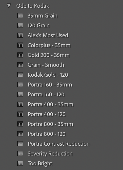
What’s Included
16 presets in total. These have been designed to be customizable, changing the exposure and white balance will be helpful after application.
Ektar 100: This preset produces strong contrast and vivid saturation, making it suitable for both daytime and evening shots & portraiture. Personally, I find it especially effective for capturing vivid sunsets, and for portraiture, I tone down the red tones to create a more atmospheric, moody effect.
Kodachrome 64: Kodachrome is a versatile film known for its soft yet colorful look that can be applied to any lighting scenario. It is particularly effective in achieving an old-school aesthetic. When green tones are present in the subject or the midday sun needs to be subdued, I rely on this look the most.
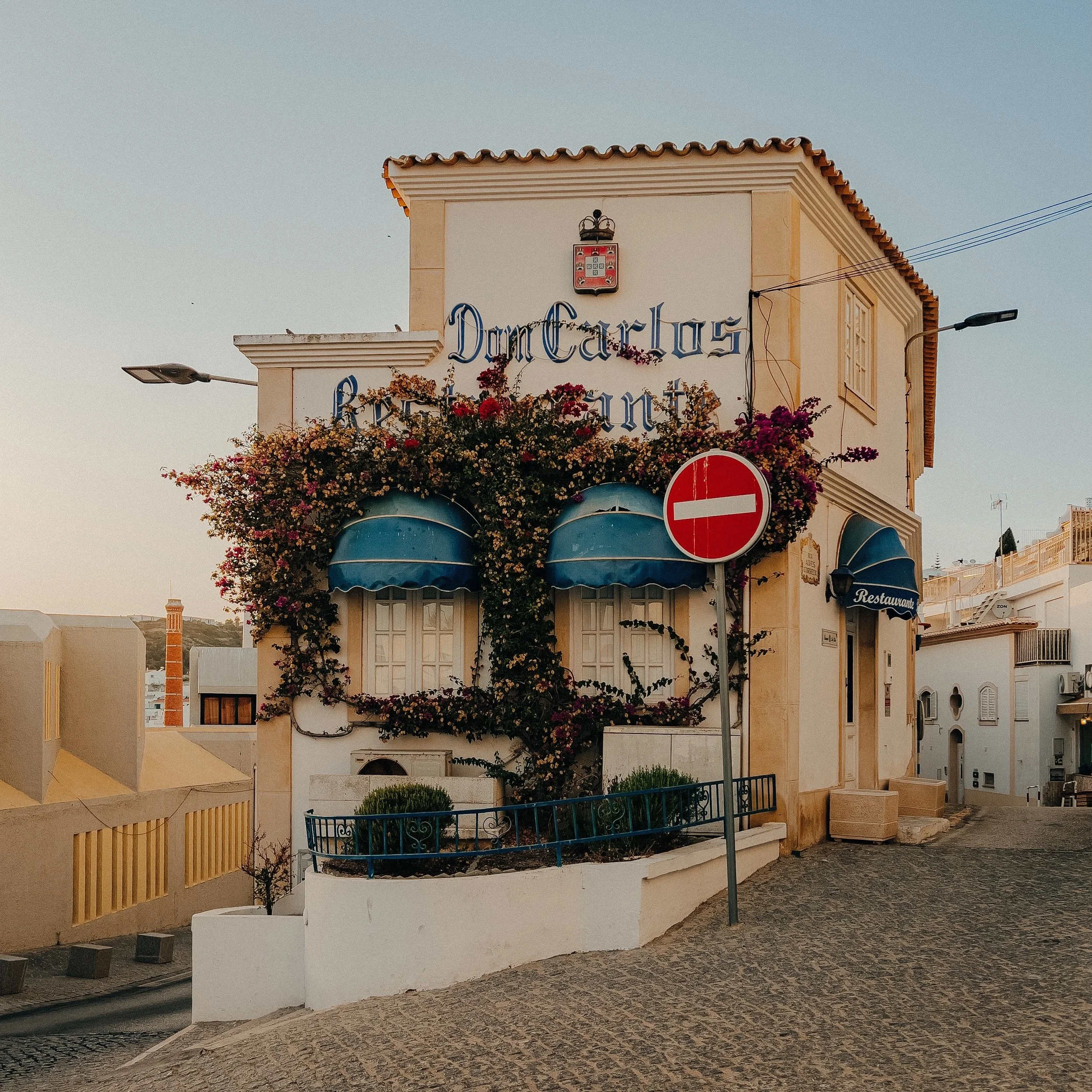
Kodachrome Saturated: This preset achieves the signature Kodachrome look with a touch more saturation, resulting in an image with added vibrancy. It's perfect for colorful buildings or capturing friends in beautiful surroundings.
Ektar 100 ( - , + ): Ektar pushed and pulled. Essentially giving and taking contrast. Perfect for using the Ektar look, but giving you more control.
Kodachrome 64 ( + ): Kodachrome pushed. Adds a stronger color profile for when you’d like your images to look that much more ‘filmy.’“Film Tools”
Apply 35mm or medium format grain.
Ability to reduce Ektar’s contrast in dynamic situations.
Image “warmers.” How I like to introduce warmth into my shadows.


FAQs
1. How would you suggest using these presets?
I’d suggest using them exactly as I do:
To begin editing your photo, it's crucial to adjust the white balance (WB) first. I typically opt for the Auto WB setting in Lightroom to see the program's recommendation. However, this can be hit or miss. Sometimes it's very helpful and improves the photo, while other times it dramatically cools or warms it, negatively affecting the final result. Regardless, I always consider the suggestion and adjust the sliders accordingly. Generally, I tend to warm up my photos using the temperature slider, as I prefer my sunny shots to reflect the warmth of the environment. It's important to note that white balance is crucial not only for these presets, but for all photos, as it has a significant impact on the overall mood and feel of the image.
It's time to select your preferred preset! I usually try out each option to see what kind of result each produces. For portraits and landscapes, I tend to favor the 120 selections for their fine grain, which adds to the sharpness of the image. On the other hand, when I want a bit more texture throughout the photo, I opt for the 35mm selections. If you find that you like the look of a particular preset but aren't satisfied with the grain style, you can always modify it by selecting either "35mm grain" or "120 grain."
One notable feature of Lightroom presets is the option to adjust the strength of the effect. Once I've selected a preset, I often check to see if I prefer it at full strength, toned down, or even intensified to better achieve the desired result. This has been particularly useful with Portra 800 in both directions and toning down the preset can be helpful with images taken on phones.
From here on out, feel free to experiment! Make any adjustments you feel are necessary, or simply leave the photo as is once you've applied the WB and preset. As I mentioned earlier, these presets are designed to mimic film, and sometimes that's all you need. For my own photos, I tend to lower the whites and highlights to achieve a softer overall look.
2. How did you decide on this price?
To put it simply, I want these to be accessible to everyone. I’m hoping these will make it easier to approach the world of editing and also provide more experienced folks with a refreshed look for their images.
3. How do I install these?
Download the folder to your files. Make sure to unzip it after downloading.
Add the DNG photos to Lightroom. Think of these images as the 'preset placeholders.' The preset data is within each one. Names of the preset are attached to the photo.
Open the photo and in the Presets tab, select the top right 3 dots and select: Create Preset. This will add the settings from the photo and you can name it according to the file name.
Add it to any group you want, but I'd suggest making a group and name naming it Ode to Kodak to organize them :)
Something to note, these files have to be this size in order to retain the preset data. Once you've created the presets, I'd recommend deleting all the photos to save your phone some space.
After all this, you should be good to go! Please let me know if you have any questions and I'd be happy to keep walking through.
4. Any other tips?
I enjoy applying “upright” to my images with architecture with them. Having straighter lines can help improve an image quite a bit.
I’ll occasionally apply the preset, export the photo, and then import the edited photo back into Lightroom. Editing from that point is sort of like editing a film photo at that point in my mind.
Play with the white balance a lot, which can dramatically change the quality of a photo.
Check back here for added tips :)